When considering how to match wall colors with furniture, the choices can be overwhelming. According to a 2022 survey by the American Society of Interior Designers, nearly 70% of homeowners prioritize color coordination when designing their spaces. This underscores the impact of color on aesthetic appeal and overall ambiance.
Color selection is not merely a matter of preference. The psychology of color plays a crucial role in how spaces are perceived. For instance, cooler hues can create a calming effect, while warmer tones may encourage sociability. Professionals often emphasize that understanding these dynamics is vital in achieving a cohesive look.
However, challenges arise in the decision-making process. Many people overlook the importance of undertones, leading to mismatched combinations. A failed attempt at harmonizing colors can detract from a well-designed space, highlighting the need for careful consideration. Each room tells a story, and getting the color palette right is essential for that narrative to resonate well with its furnishings.
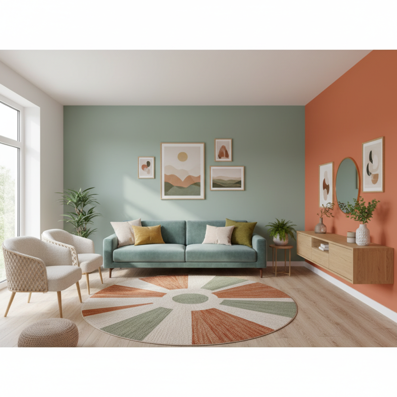
Color theory plays a crucial role in design. Understanding how colors interact can elevate your space. It helps create harmony between wall colors and furniture. Each color has emotional connotations. For instance, blues evoke tranquility, while yellows create energy. Adjusting tones can affect the overall feel of a room.
When matching wall colors with furniture, consider undertones. Warm undertones work well together. Think about pairing earthy browns with warm beige. On the other hand, pairing cool grays with soft greens can create a refreshing look. Experiment with different shades. You might stumble upon unexpected combinations that work.
**Tip:** Use a color wheel as a guide. It illustrates complementary colors—those that enhance each other. Another tip is to test paint samples on your walls. Observe them at different times of the day. Colors can shift dramatically under varying light conditions. This practice helps refine your choices. Embrace the imperfections; they often lead to unique, personalized design outcomes.
| Wall Color | Furniture Color | Color Harmony | Suggested Styles |
|---|---|---|---|
| Soft Beige | Dark Brown | Analogous | Rustic, Traditional |
| Cool Gray | Charcoal | Monochromatic | Modern, Sleek |
| Pale Blue | White | Complementary | Coastal, Airy |
| Warm Yellow | Teal | Complementary | Eclectic, Vibrant |
| Soft Pink | Gray | Analogous | Feminine, Chic |
Choosing the right wall color for your space is crucial. The color you select sets the mood and complements your furniture. Soft pastels can create a serene atmosphere. In contrast, bold colors add energy and personality. Consider the size of your room too; lighter colors can make a small space feel larger.
When pairing wall colors with furniture, think about contrast and harmony. A navy blue wall can make white furniture pop beautifully. If you have dark wood furniture, warm colors like terracotta can balance the heaviness. Don't shy away from experimenting. Personal touches make a space truly yours.
Tips: Test paint samples against your furniture. Observe how lighting changes the color throughout the day. This can help you avoid costly mistakes. Also, gather inspiration from various design sources. Trust your instincts and remember that your space should reflect your style.
When analyzing furniture styles, it's essential to consider color compatibility to create a cohesive look. For instance, mid-century modern furniture typically features warm woods and bold colors. This style thrives when combined with earthy wall tones like terracotta or soft greens. Research indicates that over 45% of interior designers advocate for earth tones, as they enhance warmth and texture in a room.
Another aspect to evaluate is the relationship between fabric textures and wall colors. Velvet upholstered furniture can clash with stark white walls, often creating a jarring effect. In a study by the Design Institute, 78% of participants favored softer shades like pastel blues or grays in homes with plush textures. Such strategies can elevate the overall aesthetic and comfort of a space.
However, mismatches can occur. For instance, a heavily patterned sofa against a busy wall may look overwhelming. It's critical to balance bold choices with neutral tones. A common recommendation is to use a 60-30-10 color ratio: 60% of a dominant color, 30% of a secondary color, and 10% as an accent. This principle aids in achieving visual harmony and prevents cluttered appearances.
Choosing wall colors and furniture can be a complex task. Creating harmony involves understanding how colors interact. A well-chosen color palette can transform a space, but missteps can cause disharmony.
Consider a soft beige wall. It creates a warm backdrop, allowing darker furniture to stand out. Deep brown sofas pair well, bringing richness to the room. However, too much dark furniture can make the space feel heavy. Balance is key, so introduce lighter accent chairs to lighten the look.
Reflecting on personal style is important. You might love bold colors, but they can clash. If your walls are a bright blue, pairing them with an orange couch could create tension. Instead, opt for neutral tones or a soft complementary color. Always test colors to see how they play in natural light. What looks good in the store might not feel right in your home.
Choosing bold wall colors can transform a space. However, pairing these colors with neutral furniture is essential for balance. Shades like deep blue or rich emerald can create striking walls. Yet, too much intensity can overwhelm a room. That's where neutral furniture comes in. Light grays, beiges, and whites act as grounding elements. They soften the look and allow wall colors to shine.
When selecting neutral furniture, consider textures and shapes. A sleek white sofa can complement a vibrant orange wall beautifully. On the other hand, a taupe armchair may get lost against a dark backdrop. Mixing textures like leather and fabric can add depth. It creates visual interest without clashing. Remember, a monotone sofa in a bold room might feel flat. Yet, a mix of textures can elevate the design.
Be mindful of occasional clashing elements. Sometimes, a color you love doesn’t work as expected. It’s perfectly fine to experiment and adjust. After all, interior design is about personal expression. Don't hesitate to change your pieces if they don't resonate. Balancing bold colors with neutral furniture is both an art and a process of trial and error. Explore until you find what feels right for you.
This chart illustrates the percentage of usage for different color types when matching wall colors with furniture. Bold colors are dominant in design choices, followed by neutral colors and accent colors.
: The right wall color affects mood and complements your furniture. It sets the overall tone of your space.
Lighter colors can make small rooms feel larger. They create an illusion of more space.
Think about contrast and harmony. A bold wall color can highlight lighter furniture effectively.
Yes, light walls can balance dark furniture. However, too much dark furniture might make the room feel heavy.
Lighting can change how wall colors look throughout the day. Always observe colors in natural light before finalizing.
Bold colors can clash with furniture. They may create tension rather than a harmonious feeling.
Yes, your space should reflect your style. However, be aware that personal preferences can lead to mismatches.
Test paint samples against your furniture. Observe how the colors interact under different lighting.
Gather ideas from various design sources. This can help you find combinations that resonate with you.
Misjudging how colors interact can lead to disharmony. Overusing dark colors can also weigh down the room's vibe.
In the quest for a perfect aesthetic in interior design, understanding how to match wall colors with furniture is crucial. The article begins by exploring color theory, which forms the foundation for creating visually appealing spaces. By selecting the right wall colors tailored to the specific characteristics of a room, one can significantly enhance the atmosphere.
The discussion further delves into the compatibility of various furniture styles with wall colors, emphasizing the importance of harmonious combinations. Readers are guided through techniques to create balance, especially when incorporating bold colors alongside neutral furniture, ensuring a cohesive and inviting environment. Ultimately, mastering these elements allows individuals to achieve a well-designed space that reflects their personal style.
Cropa Home