Color plays a vital role in interior design, influencing emotions and behaviors within a space. According to the "2022 Color Trends Report" by the Pantone Color Institute, color has the power to lift moods and enhance productivity. It’s essential to understand why color is important in interior design. Expert designer, Kelly Wearstler, emphasizes, “Color is the emotional cornerstone of a space.”
Proper color selection can transform an area, creating warmth or adding vibrancy. In residential settings, for instance, soft blues and greens promote relaxation, whereas vibrant yellows can stimulate creativity. The American Psychological Association notes that color can affect human behavior, impacting decision-making and even stress levels. Most homeowners might overlook these effects when choosing colors.
Furthermore, color trends evolve, yet the core principles remain. As designers, we must reflect on how these shades impact personal style and function. The challenge lies in balancing aesthetics with practicality. Colors that evoke a response need to be carefully integrated into designs, ensuring they meet the unique needs of each space and its occupants.
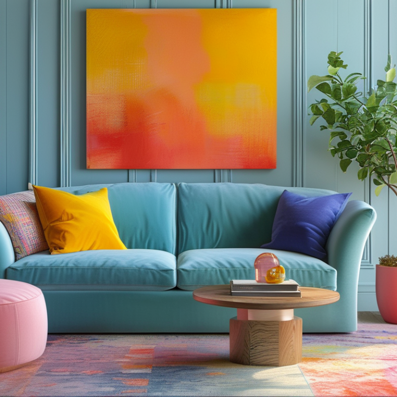
Understanding Color Psychology in Interior Design
Color plays a crucial role in interior design. It can influence mood, perception, and even interactions within a space. Understanding color psychology helps designers create environments that resonate emotionally with occupants. For instance, warm colors like red and orange often evoke energy and excitement. These shades can be great for social spaces but may feel overwhelming in a quiet room.
Cool colors such as blue and green tend to bring calmness and tranquility. These colors are ideal for bedrooms or offices where focus and relaxation are essential. However, an overuse of blues might feel cold or sterile. Balancing these tones is key. Incorporating neutral colors like beige or gray can ground vibrant hues, allowing for harmony.
Personal reflection is vital in color selection. What feelings do certain colors evoke for you? Each individual's experience shapes their perception of a color. Engaging with your own emotional response can lead to more meaningful design choices. Experimenting with different palettes can reveal unexpected preferences. This exploration can enrich not only your space but your well-being as well.
Choosing the Right Color Palette for Different Spaces
Choosing the right color palette for different spaces is crucial in interior design. According to the American Institute of Architects, color can impact mood and perception significantly. Warm colors, like red and yellow, energize a space, while cool colors, such as blue and green, promote calmness. Therefore, selecting colors based on room function is essential.
For living areas, neutral tones are popular. They create a comforting backdrop. Adding bold accents can enhance personality. Research indicates that over 70% of homeowners prefer soft palettes for these spaces, as it fosters an inviting atmosphere. However, relying solely on popular trends may lead to a lack of uniqueness. Each home tells a story, and its colors should reflect that narrative.
In contrast, workspaces often benefit from sharper contrasts. Bright hues can stimulate productivity. However, care should be taken not to overwhelm. In fact, studies show that excessive vivid colors can lead to distractions. Many professionals suggest a balanced approach, combining both bright and soft shades to create an engaging environment. This method allows for creativity while maintaining focus. Yet, finding that balance can be challenging and may require multiple attempts.
Effective Use of Color in Interior Design
Techniques for Combining Colors Harmoniously
Color plays a crucial role in interior design. Its combination can create mood, define spaces, and influence perceptions. A study by the Institute for Color Research found that color increases brand recognition by 80%. This reveals its potential in home aesthetics as well.
To combine colors harmoniously, start by understanding color theory. The color wheel is essential. Complementary colors, like blue and orange, can add vibrancy. Analogous colors, such as blues and greens, create a calming effect. However, too much blue may feel cold. Balance is vital. Use neutrals to anchor brighter colors without overwhelming the space.
Another technique is the 60-30-10 rule. This guideline suggests using 60% of a dominant color, 30% of a secondary color, and 10% for accents. This method ensures visual interest while maintaining cohesion. It’s easy to fail here; overusing a bold color can disrupt harmony. Regularly stepping back and evaluating your choices can lead to a more thoughtful design.
Impact of Lighting on Color Perception in Interiors
Lighting is a crucial element that influences color perception in interior spaces. According to a study by the International Association of Color Consultants, about 90% of our environment's mood is affected by lighting. Natural light can enhance colors, making them appear more vibrant or subdued. For instance, an orange hue can look warm and welcoming in daylight, but can turn dull under artificial yellow light.
One of the most effective ways to utilize lighting is through layering. Ambient lighting sets the general mood, while task lighting highlights specific areas. Accent lighting can create focal points and add depth to a room. A report from the Lighting Research Center indicates that rooms with layered lighting can improve the visibility of colors by up to 60%. This means colors can appear more saturated and true to their essence.
Despite these advantages, many people overlook lighting's role in color choice. Choosing the right light bulbs is often underestimated. Bulbs with a high Color Rendering Index (CRI) can better reproduce true colors. However, many ignore this factor and end up with colors that clash or appear inconsistent. Considering the impact of lighting is essential for achieving a balanced and aesthetically pleasing interior.
2026 How to Use Color Effectively in Interior Design? - Impact of Lighting on Color Perception in Interiors
| Color |
Mood/Emotion |
Best Lighting Type |
Example Use in Interiors |
| Red |
Passion, Energy |
Warm White |
Accent Walls |
| Blue |
Calm, Trust |
Cool White |
Bedrooms |
| Green |
Balance, Growth |
Natural Light |
Living Rooms |
| Yellow |
Happiness, Positivity |
Soft White |
Kitchens |
| Gray |
Neutral, Sophisticated |
Daylight |
Modern Spaces |
| Purple |
Luxury, Deep Thought |
Warm Light |
Home Offices |
Utilizing Accent Colors to Enhance Design Themes
Accent colors play a vital role in interior design. They bring life to a room and create focal points. Using these colors effectively can enhance the overall theme of any space. For instance, think of a neutral-toned room. A splash of vibrant yellow or deep teal can energize the environment. It draws attention to specific features, like artwork or furniture.
Consider balance when choosing accent colors. Too many bright shades can be overwhelming. A well-placed accent should complement the primary colors. A single crimson cushion on a gray sofa can transform an entire seating area. Experimenting is part of the process. Sometimes, what seems right may not resonate after a while. Reflect on how colors make you feel.
Lighting impacts how we perceive colors. Natural light can make hues appear different throughout the day. Under warm light, soft blues may look inviting. Under cool light, they may feel stark. Recognize these changes. Adjustments may be needed as the light shifts. Embrace the journey of color exploration in your interior space.
FAQS
: Color significantly influences mood and perception. Warm colors like red evoke energy, while cool colors bring calmness.
Warm colors create excitement, making them ideal for social areas. However, they can feel overwhelming in quieter spaces.
Personal reflection helps identify your emotional responses to colors. This can lead to more meaningful and personalized design choices.
This rule suggests using 60% dominant color, 30% secondary color, and 10% accent color for balance and visual interest.
Lighting greatly affects how colors appear. Natural light makes colors more vibrant, while artificial light can dull them.
Understanding color theory helps in combining colors harmoniously. Different combinations can evoke distinct feelings and atmospheres.
Neutral colors ground vibrant hues, providing balance. They can help harmonize brighter tones and create a cohesive look.
Light bulbs with a high Color Rendering Index (CRI) better reproduce true colors. Poor bulb choices can lead to color clashes.
Many overlook the impact of lighting in color selection. This can lead to inconsistently appearing colors in a space.
Layering ambient, task, and accent lighting can improve color visibility. This technique helps create depth and emphasizes the room's colors.
Conclusion
Color plays a pivotal role in interior design, heavily influencing the mood and ambiance of a space. Understanding color psychology is essential, as different hues evoke various emotional responses. For instance, warm colors can create a sense of energy and warmth, while cool colors often promote calmness and relaxation. When selecting a color palette, it's crucial to consider the function of each space; a vibrant palette may be suitable for entertaining areas, whereas soft, neutral tones might work best for tranquil bedrooms.
Effective color combinations can enhance the overall aesthetic, making it important to master techniques for harmonizing hues. Additionally, lighting significantly affects how colors are perceived, transforming a room's look and feel throughout the day. Utilizing accent colors can also add interest and align with specific design themes. Ultimately, "why is color important in interior design"? It shapes the emotional experience and sets the tone for how we interact with our environments.
 Cropa Home