A successful interior layout begins with how people actually move, pause, work, and rest. The best rooms are not merely attractive. They reduce awkward steps, improve natural light, and make daily routines feel calmer. This guide explores top interior layout ideas for any space, from compact apartments to open-plan family rooms.
So, what is the best layout for interior spaces? There is no universal answer. The right arrangement depends on the room’s dimensions, windows, doors, furniture scale, and purpose. An experienced designer studies these details before choosing a style. John Pawson, the respected British architect, offers a useful principle: “The minimum could be defined as the perfection that an object attains when it is no longer possible to improve it by subtraction.” His words support a practical approach: remove visual obstacles, protect clear walkways, and keep only furniture that serves the room.
Measure twice. Then test the plan.
You can mark furniture positions with painter’s tape before moving heavy pieces. Leave comfortable circulation around seating, dining areas, and storage. Place task lighting where activities happen, not where empty corners look attractive. A sofa may appear perfect online, yet overwhelm a narrow room in person. That matters. The most reliable layout often emerges through small adjustments, honest observation, and lived experience. Some spaces will still feel imperfect, and that is useful feedback. A room should support real behavior, not an idealized photograph. This outline will examine zoning, balance, flexibility, proportion, and common planning mistakes.
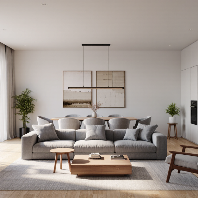
Top Interior Layout Ideas for Any Space?
Understanding Space, Function, and Interior Layout Goals
A successful interior layout begins with observation, not furniture shopping. I measure wall lengths, window positions, door swings, and walking paths. Natural light changes the room throughout the day. Morning glare may affect a desk, while evening shadows can make a corner feel closed. I also note awkward details, such as a radiator or uneven wall. These limits often shape the strongest plan.
Function should guide every placement. A living room for quiet reading needs different clearances from one used for hosting guests. Keep main routes open, usually around 90 centimeters where possible. Place frequently used items within easy reach. In a small kitchen, a narrow work zone may outperform a crowded island. The best arrangement feels calm because movement is predictable. It should not require constant rearranging.
Layout goals need to be specific. “Make it comfortable” is too vague. Try “seat four people,” “protect a work corner,” or “store daily shoes near the entrance.” I test plans with masking tape on the floor and live with them for a day. It exposes problems that drawings miss. I once placed a chair perfectly for balance, yet it blocked a cabinet door. That mistake was useful. A beautiful plan still fails when real habits are ignored.
Recommended clearances help balance movement, comfort, and function in residential interiors.
The chart compares common residential planning benchmarks: 36 inches for primary circulation and dining-chair clearance, 42 inches for a one-cook kitchen work aisle, and 48 inches for a two-cook kitchen work aisle.
A useful layout begins with accurate measurements, not attractive furniture pictures. Record each wall, window, door, radiator, outlet, and ceiling change. Measure twice. Small errors can create large problems near corners and door swings. Sketch the room on graph paper, or create a simple scaled digital plan. Keep the original measurements beside the drawing for reference. This habit makes later decisions more reliable and easier to explain.
Next, map essential movement paths before placing large furniture. Mark routes between the entrance, seating, storage, kitchen, bathroom, and outdoor access. A main walkway often needs about 90 centimeters of clear width for comfortable daily movement. Wider space may be necessary where people pass, turn, or carry objects. Open doors and drawers fully during testing. A beautiful cabinet is poorly planned if it blocks a doorway.
Use masking tape on the floor to outline sofas, tables, beds, and work zones. Walk through the room at different times of day. Notice where bags collect, where chairs scrape, and where people naturally cut across the planned path. The first plan may fail. That is useful information, not wasted effort. I once allowed enough space beside a table but forgot the chair’s backward movement. Revising the layout improved the room more than choosing better furniture. Leave flexible space for changing routines, visitors, and unexpected daily clutter.
| Space or Planning Element | Recommended Measurement | How to Measure or Map It | Layout Idea | Practical Planning Note |
|---|---|---|---|---|
| Main circulation path | At least 36 in (91 cm) wide | Measure the clear distance between furniture edges, walls, and fixed fittings. | Position large furniture along the perimeter and keep the central route visually simple. | A wider path is preferable in busy areas or where two people need to pass comfortably. |
| Secondary passage | Approximately 30–32 in (76–81 cm) | Trace the route from the entrance to less frequently used areas, such as storage or a side table. | Use secondary paths behind seating groups or beside cabinets without interrupting the main route. | Avoid allowing doors, drawers, or reclining furniture to reduce the clear width. |
| Living room conversation area | 36–48 in (91–122 cm) between facing seats | Measure from the front edge of one seat to the front edge of the opposite seat or table. | Arrange seating around a shared focal point, such as a coffee table, fireplace, or view. | This distance supports conversation while leaving enough room for circulation around the group. |
| Coffee table clearance | Approximately 16–18 in (41–46 cm) | Measure from the nearest edge of the sofa or chair seat to the closest edge of the table. | Center the table within the seating zone rather than directly in the room’s main walkway. | Keep the table close enough for comfortable reach but far enough to allow people to stand and sit. |
| Dining chair clearance | 36 in (91 cm) behind a chair in active use | Measure from the table edge to the wall, sideboard, or other obstruction behind the pulled-out chair. | Place the dining table where chairs can be pulled out without blocking a doorway or principal route. | Allow more space where people regularly walk behind seated diners. |
| Dining table seating width | 24 in (61 cm) per person | Divide the usable table length by the number of intended seats. | Keep the table proportionate to the room and align it with the longest available wall or axis. | This provides a practical personal zone for place settings and dining movement. |
| Kitchen work aisle | 42 in (107 cm) for one cook; 48 in (122 cm) for multiple cooks | Measure between opposing countertop fronts, appliance faces, or cabinet edges. | Organize the refrigerator, sink, and cooktop so preparation, cooking, and storage routes do not cross unnecessarily. | Maintain the full clear width with appliance doors and drawers closed or open as appropriate to the task. |
| Kitchen walkway | At least 36 in (91 cm) | Measure the unobstructed route that does not serve as the primary work aisle. | Separate through-traffic from the main cooking zone whenever the room allows. | Avoid placing stools or freestanding storage where they narrow the route during daily use. |
| Bedroom bed access | Approximately 24–30 in (61–76 cm) on each accessible side | Measure from the bed frame to the nearest wall, nightstand, or other fixed object. | Center the bed on the most appropriate wall and keep one continuous route to the door. | A larger clearance improves bed-making, cleaning, and shared access. |
| Bed-to-dresser clearance | Approximately 36 in (91 cm) | Measure from the front of the dresser to the nearest edge of the bed or other obstruction. | Place the dresser outside the bed’s primary turning zone where possible. | Check the space with drawers fully extended, not only when the dresser is closed. |
| Bathroom fixture clearance | At least 21 in (53 cm) in front of a fixture | Measure from the front edge of the toilet, basin, or bidet to the opposite wall or fixture. | Keep the central floor area open and place storage in vertical or recessed locations. | Local building regulations may require greater dimensions, especially for accessible bathrooms. |
| Door swing zone | Full arc of the door leaf plus a clear landing area | Draw the door’s swing arc on the floor plan and mark the area that must remain unobstructed. | Use sliding, pocket, or outward-opening doors where a conventional swing would conflict with furniture. | Confirm that the door does not collide with another door, a cabinet, or a major circulation route. |
| Entry drop zone | Approximately 36 in (91 cm) of clear passage | Measure the route from the entrance to the main living area, stairs, or storage. | Combine a narrow console, hooks, seating, and a tray without narrowing the arrival path. | Place frequently used storage near the entrance to reduce movement through the rest of the home. |
| Work-from-home desk zone | 30–36 in (76–91 cm) behind the chair | Measure from the back of the pushed-in chair to the wall, cabinet, or circulation path. | Orient the desk toward natural light or a wall while keeping the chair outside the main traffic lane. | Account for the chair at full extension and for cable management along the wall. |
| Universal-access route | At least 36 in (91 cm) clear; 60 in (152 cm) turning diameter where needed | Map the route with furniture, doors, and fixtures shown at their maximum operating positions. | Use simple, continuous routes with minimal level changes and generous turning areas. | Accessibility requirements vary by jurisdiction and should be verified against applicable regulations. |
In my room-planning work, I start with movement, not decoration. A comfortable layout should leave clear paths between doors, windows, and frequently used furniture. Measure the room before shopping. A simple sketch can prevent expensive mistakes.
In a small living room, place the sofa against the longest wall and angle one chair toward it. Keep a small table within easy reach, but protect the walkway.
For open-plan spaces, use a sofa back or low shelf to define the living area. The zones should connect visually.
In a narrow room, avoid lining every wall with furniture. That choice can make the space feel like a corridor.
Bedrooms need calm circulation. Leave enough room to open drawers and walk around the bed. In compact rooms, two small bedside tables may work better than one oversized cabinet.
For a home office, position the desk near daylight, while keeping the screen away from direct glare. In shared rooms, flexible pieces can support changing needs. A movable chair helps.
I once placed a large rug too close to a doorway. It looked balanced, but the edge caught shoes. The lesson was practical: appearance cannot replace daily testing.
Sit down. Walk through the room. Notice what feels awkward. A layout may look correct on paper and still fail during a busy morning.
A strong interior layout balances light, storage, proportion, and visual flow. The U.S. Environmental Protection Agency estimates that people spend about 90% of their time indoors. That makes daylight and movement practical design priorities, not decorative extras. Place desks, reading chairs, and dining seats near windows when possible. Keep tall cabinets away from primary light sources. A clear walking path of 90 to 120 centimetres usually feels comfortable, though small rooms may need compromise.
Storage should support daily habits. Observe where bags, shoes, cables, and paperwork actually collect. Then place storage close to those friction points. Open shelving can create visual rhythm, but too much of it exposes clutter. Closed units offer calm, yet they may make a compact room feel heavier.
The U.S. Department of Energy notes that daylighting can reduce lighting demand, depending on windows, orientation, and controls. I sometimes overestimate how much furniture a room can carry. A scaled floor plan reveals that mistake quickly.
Tips:
Use one dominant circulation line. Repeat two or three materials across the room. Leave breathing space around major furniture. Test evening lighting, not only daylight. The layout should guide the eye without forcing it. A little asymmetry can feel human. Perfect balance can feel strangely flat. Review the plan after one week of real use, because lived experience often exposes what drawings miss.
Top Interior Layout Ideas for Any Space
Adapting Layouts for Flexibility, Comfort, and Daily Use
A flexible layout begins with observing how people actually move through a room. Track morning routines, storage habits, and places where movement feels blocked. Keep main walkways near 90 centimeters wide when possible. This measurement supports comfortable passing without wasting valuable floor area. Place frequently used items between waist and eye level. Daily ease matters more than a perfectly styled photograph.
Create clear zones for work, rest, dining, and circulation. A small desk can face a window, while a movable chair supports changing needs. Use open shelving carefully, because visible storage can become visual noise. Soft lighting near seating improves comfort during reading or quiet conversations. In compact rooms, nesting tables and lightweight stools provide useful flexibility. They can move quickly when guests arrive.
I once arranged a living area around symmetry, but the walkway felt awkward. The room looked balanced, yet daily movement became frustrating. That mistake reminded me to test layouts with real furniture and ordinary routines. Leave space for doors, drawers, pets, and occasional clutter. Not every corner needs a purpose. A little emptiness can make a room feel calmer and easier to adapt. Recheck the arrangement after a week, because comfort often reveals problems that measurements miss.
Accurate measurements reveal wall lengths, window positions, doors, radiators, outlets, and ceiling changes. Small errors matter.
Aim for about 90 centimetres of clear width. Busy turning areas may need more space.
Connect the entrance with seating, storage, kitchen, bathroom, and outdoor access. Test every route with doors open.
Outline sofas, beds, tables, and work zones on the floor. Walk through them at different times.
Put desks, reading chairs, and dining seats near natural light when possible. Keep tall cabinets away from windows.
Place storage near bags, shoes, cables, and paperwork. Observe real clutter instead of guessing.
Use nesting tables, lightweight stools, and movable chairs. Leave room for visitors and changing routines.
I once allowed space beside a table but forgot the chair’s backward movement. The plan looked right. It was not.
Live with it for a week. Watch where chairs scrape, bags collect, and people naturally cut across paths.
Designing an effective interior layout begins with understanding how a space will be used, who will use it, and what atmosphere it should create. Start by measuring the room, noting doors, windows, fixed features, and natural light. Then map the main movement paths to ensure people can move comfortably without furniture blocking entrances or essential areas. A successful plan answers the question, “what is the best layout for interior spaces,” by connecting practical needs with visual balance and personal preferences.
Furniture should be arranged according to the room’s purpose, whether it is a living area, bedroom, workspace, dining space, or multifunctional zone. Consider proportion, storage, lighting, and the relationship between key pieces to create a clear visual flow. Leave enough open space for comfort, while choosing flexible furniture and adaptable zones that can support changing routines. The best layouts feel organized yet welcoming, making everyday activities easier and allowing the room to remain useful over time.

Cropa Home